Last week I began experimenting with the interior of my closet. I planned a DIY ikat pattern that wouldn’t require the use of a stencil, and would be totally f-r-e-e with leftover paint. (You can read that intro post right here.)
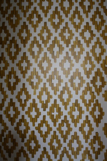
It quickly went from looking iffy to looking very cool, as I plotted around the inside of the closet creating abstract diamond-esque patterns with a 1/2″ artist’s paint brush and some leftover Burnished Bronze paint (Behr brand, the same color that I use in the hallway just outside the room).
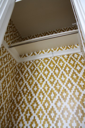
 I took it a little further than I had shown last week, realigning the tape once the first layer had dried and carefully painting more diamonds in the white space left behind. It was looking good. And if I may say, the gold and the hardwoods are like PB+J; I love how the two colors play up each other.
Over the course of 3 days, working a few hours at a time, I made my way slowly around the room while simultaneously clearing off my DVR (I somehow tape way more than I can humanly keep up with, but am loving the new Live! With Kelly + thought M-W last week with Jerry Seinfeld was awesome).
I digress. The painting project was reasonably easy, although I think that has a lot to do with the fact that it was purposely imperfect, like any traditional ikat fabric; if I had been more exacting and detail-oriented (like when I painted the stairs) it probably would have taken me a week. There are actually lots of “flaws”, such as lines of different length and heavier/lighter paint areas, but most of those imperfections vanish when you step back and look at the whole wall at once.
If you didn’t know any better, you might even think that the closet was wallpapered.
The next planned step of the process had been to fill in the middle white area with another color, a combination of grays and gray-blues to complement the Pebble Rug and gray walls of the bedroom. Much like the diamonds themselves, I didn’t see this being a consistent application, looking more like splotches and splashes of color more than something meticulously applied. I started with a test area that’s hidden just to the inside right of the doorway. And I’m glad I did…
Because it didn’t look as nice as I thought it would.
It was just… sloppy. I tried harder by making the gray and blue colors bigger, covering all of the white area, which seemed OK in photographs but still weird in real-life; not nice enough to make me want to do the whole closet that way. It took the surface from looking like pseudo-wallpaper to more so like a hand painted crafty. Pete pointed out that it would have looked more natural if the middle color was painted first, and the gold was then painted around it. Agreed, but too late unless I wanted to start over, which I did not.
So in the end, we’ve left it with the gold pattern, no other colors. With our closet once again filled (my blouses and Pete’s 152 pairs of jeans), it looks nice. Not too overwhelming (which was another concern during the process) but a nice little detail that we’ll see daily.
Most of the time, the closet’s totally hidden. We have that roller blind from IKEA serving as a door, and it’s a perfect fit. (What, you just noticed I don’t have a closet door? I know, sometimes it feels like a college dorm.)


26 Comments
That turned out awesome!
Thanks Cait! A labor of love.
Awesome job! Would love to try in our new home. Thanks for the inspiration!
Glad you like it – as I was doing it, I was thinking how great it would look as a focal wall in a real room (not just in a closet). If you give it a go, remember to send me a photo! I’d love to see how it turns out!
Ok, that is pretty awesome. I love painting fun designs on walls. Takes forever, but looks amazing… Great job. I love that it was the closet…closets shouldn’t be so boring! Makes me want to tackle one of mine.
Agreed about the closets, Suzanne! Glad you like.
I don’t know where you find the patience to do this, but it turned out great!
Thanks Monica!
This turned out awesome! I agree with Monica — I’m impressed by your patience!
Thanks Elisa!
That looks really freaking good! I’m so impressed. And that color is perfect.
I just came across your site from apartment therapy but I think that your pattern looks really cool and great job doing it by freehand, I’m just now getting into Ikat patterns and I’m actually attempting to hand paint a pillow for myself.
Anyways I just wanted to tell you that I feel that your pattern might stand out a bit more if perhaps you put a bolder color directly down the center of your pattern, like a burnt orange or a cobalt blue. I actually took the liberty on saving your picture and seeing what it would look like by photo-shopping those examples. I guess I can try emailing them to you since I don’t see a way in posting the pics on here. -Susan
Hi Susan, your idea’s of adding two additional colors to the center is a great one! I may be putting some thought around what bold colors might work with the rest of my bedroom decor. Thanks!
Hi Emily, I’m popping over from Apartment Therapy because I HAD to tell you how much I loved this project!! Fabulous job!
Thanks so much, Jen!!
Hi Emily,
Another visitor from apartment therapy, and I’m so glad I clicked on the link. I love the ikat, love it in the closet (yes, it looks like wallpaper), and am adding Merrypad to my list o’ required reading.
Not in the least because of possible glimpses of Codeman the wonder dog. We have a Berner in our home and enjoy the same ear flapping as well as ‘tweening.
Thanks for sharing!
Hey Aimee! Welcome! Glad you like the site (and Codeman). Best dogs ever, or best dogs everrr?
LOVE this and cannot wait to do this once we close on our house!!! :)
Glad you like!
Hi, I just found your site and love this idea. I studied textiles in college and weaving was my concentration. I think the reason the middle doesn’t look right is because it needs to be more broken up brush strokes like how the warp threads don’t quite line up in ikat. Perhaps using a slightly smaller brush would create that effect.
Here is what I mean about the warp threads:
http://www.jamieherzlinger.com/blog/wp-content/uploads/2011/01/weave.jpg
I am also in love with the shiplap wall idea. Keep up the fantastic job!
Right on – a smaller brush would have worked. Thanks for that example, I’ll keep it in mind for future projects! Glad you like the shiplap, and thanks for stopping by!!
I am searching for pattern ideas for the front of my retail shop, when I came across this! I am going to try this on a small wall as a focal point for the store! So excited! Was wondering how to attempt such a project!
Awesome Brittani! Send me a picture of it when you’re done, I can’t wait to see how it turns out!
Hey there! I just wanted to say thanks for the inspiration! I tried this at home and love the result!! Thanks again!
I know this is an old post and I’ve seen it a long time ago, you’ve totally inspired me to tackle my hallway today!! :)
Also, I’m not sure if you’ still live there or have this going on in the closet but you should ikat your roller shade too.
xoxo
Glad you liked! I no longer live there, but an ikat roller design would have been a fun complement!