Sherwin-Williams graciously sponsored this post! We are so lucky to have them pitching in to help support our super summer of painting. If I haven’t already made it very clear, I’m eager to lose all of this beige.
We learned pretty fast that our new house, despite its picture windows and great views, is a very shaded little hideaway. Sunny days are our friends, but when it’s overcast, or rainy, or sunset, this place is downright dark.
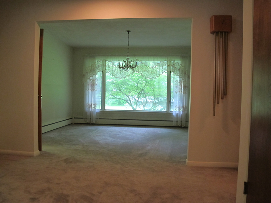
Dining room on move-in day.
The Backstory
We attribute the shadiness of the home to a few things:
- Holy cow, there are a lot of leaves on the trees. The first few times we toured the house before closing, the trees were totally naked. The sunlight flooded in, or at least in my memory, it did. If I’m right, that bodes well for the quality of my winter/early spring posts.
- Deep eaves. The eaves around the house provide 36″ of overhang + 6″ of gutters. Deep eaves are a generous design detail, one that we really love especially when we’re trying to scurry around the perimeter of the house in a rainstorm, but they really shield the sunlight when it’s overhead.
- Privacy plants. I don’t know how else to refer to the fact that there are trees and bushes planted in front of every single window in the house, like in the above picture. The idea of removing them pains us, but doing so would also improve our views and increase natural daylight.
- Flat matte paint. All of the paint (save for the bathroom which is appropriately a semi-gloss) is the flattest of flat matte paint. Matte paint limits any opportunity for natural light to bounce around a room and brighten it up. There’s no glimmer of reflection. It’s all light absorption happening up in here.
So with all of that put out there, we knew that we would want to change up the color palette and the paint finish. It’s one of those things that would have been really nice to do before we moved in, but we also wanted to live with the space and observe how the natural light felt. When I bought my last house, I had the paint palette picked out even before I moved in, and then had the whole house had been repainted within the first few weeks of living there.
Obviously, I’ve proven myself to be an eager little bee, but this home is a bit different. I’ve said before, we’re taking our time making decisions and also going in a different direction. Also, painting is a bigger investment–both financially and in time thanks to the extra 700 sq. ft.–and sponsorship with Sherwin-Williams aside, we will still be making some investments and sacrifices to get the job done. After all, it’s not just the walls, we’ll have to get to the trim and the baseboard systems, and switch and outlet covers as well, as they’ve all been painted flat-matte-matte-flat.
What makes this new palette process easy, however, is that we’ve agreed to adopt white. Are we a total bore fest, or are you excited? We have a good vision in mind, and white is the basis for this plan. And if for no other reason, going with a white satin will help to illuminate the rooms in a different way, hopefully helping to brighten things up in here. Maybe down the road we’ll want to add wall color, but for now we’ll settle in and try and brighten the space up as much as we can.
Finding the Right White
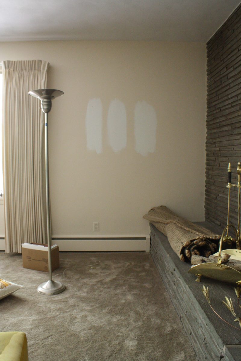
I started off this whole undertaking at Sherwin-Williams, where I studied its Whites and Lights booklet. I bought myself three samples: Extra White (SW 7006 which is actually just paint straight out of the can, surprise!), Snowbound (SW 7004, a “cool” white), and Alabaster (SW 7008, a “warm” white). And OMG, don’t they all look beige here? They’re color samples from the website. I did not try and photograph my chip book.

I started putting the colors on the walls over the weekend. All photos following are in the Extra White-Snowbound-Alabaster order, and we’ve been trying to decide between the three. There is a clear difference between the warm and the cool in person, though subtle.
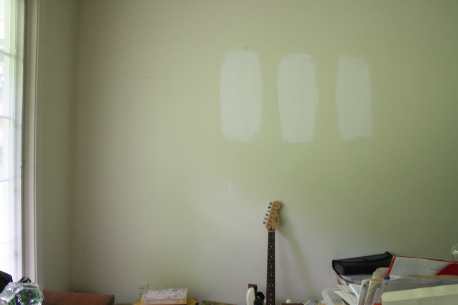
Testing Extra White, Snowbound, and Alabaster paint colors.
The photos really begin to show how dark this home is during the daytime. I was shooting on a very high ISO and an incredibly slow shutter speed, so let there be noise and blur. Also, let me find time to hook up a TV in this house. Three weeks in and we’ve had zero screen time.

Three shades of Sherwin Williams paint: Extra White, Snowbound, and Alabaster
I’ve been reading blog posts and reviewing photos that use any one of these shades of white in mass; peeps either like and hate the warm or cool whites, there are definitely strongly worded reviews of the three shades out there. They almost look the same to me. I’ll be honest, if you came in here and painted a whole room for me, I probably wouldn’t be able to tell which color you chose. The three selected are that close.

Get out of here, baby blue walls.
The “warmer” white on the far right of each of these photos is compelling too though, even if it is the closest relative of the warm beige I’m retiring.
And I think I can dismiss the Extra White (straight out of the can white), even though I’ve used it for years (on all trim and in my old kitchen, for example). In this instance, it seems a little lacking. But again, paint a whole room with it and I probably wouldn’t know the difference.
Choosing between three shades of white paint.
The patches of paint throughout the house already help to demonstrate how much reflection and natural light glow we’ll glean from a glossier, lighter paint finish. Whichever color we decide upon, we know that going in any direction is going to help this place immensely.
You can see the next post in this series here. Spoiler alert: We chose Sherwin Williams Snowbound!


10 Comments
When we moved into our home, every wall (yes, EVERY!) was straight out of the can, flat, white. Our home is also very shaded-we have a tree line right where the sun sets and we have a gigantic pine tree that shelters our house during the day…awesome during the hot summer months, but it can get a little depressing in the winter! We personally couldn’t wait to spice up the rooms and add tons of color, but after reading your post, I agree that if the paint wasn’t flat, perhaps it wouldn’t have looked so cold and “sterile” to me. We wound up with shades of brown/tan and lots of blue! I would personally go with your middle option. I feel like the 3rd color is a bit too close to what you are trying to rid of. Whatever you choose though, I’m sure it’ll look fabulous! Good luck and happy painting! :)
We have similar issues in our house. We painted the entire main floor colonnade grey (sherwin williams) and it still feels a tad too dark. I have learned to pick much lighter colors than I would normally consider (and that I sometimes am not so sure about during the first coat). I would vote extra white or snowbound!
It could be that a different shade works better in each room, and they’re not so vastly different that it would be apparent.
If I had to pick one based on your post, I’d go with Extra White or Alabaster. Snowbound reminds me of my current workspace — a temporary space that someone in our business office probably thought was a neutral/cool gray, but in a room with no windows and only artificial or fluorescent lights, it’s got a horrible mauve tint. I can’t wait to move, even if we are moving to a space with a “lovely” shade of almond instead.
Painting over the beige will go a LONG way, in my experience! Personally, I’d go with the warmer white since shade makes things look cool in general, you could counteract the shade with a (almost imperceptibly) rosy white? Ours had more than a hint of warm, but I loved it. (http://myfriendstaci.com/2011/09/07/let-there-be-white/)
I think #3 -the alabaster colour . We bought a similar house of a similar vintage 12 years go and love the shade those plants by the windows provided but ultimately thy had to go. It’s not healthy for the house to have planting s so close to the foundation. They were likely planted 40 years ago and at t hat time the scale was right but they grew. They also encourage spiders to live in and around yor home which whenever liked.
I had the same quandry –and I was painting only one room, that has one window, that gets light at around 3pm. I went with Benjamin Moore paint –White Dove–and I went with flat. It is fine for right now but I will probably change it. Too yellow and now I wish I went with an eggshell finish. Our home is similar in region–we are in Syracuse (actually Liverpool)-north of 90. We also have a big maple in the backyard although we did take down the elm that was diseased more directly behind the house, there is a line of pine trees bordering the edge of our back yard. Our house was built in the late 70’s. Your home looks so familiar–just like my friend’s house that lives in Bayberry, particularly the detail–built-ins in the corners of the dining room, the trim/wainscoting etc. She had the most horrible and tenacious wallpaper and colonial blues painted on the trim. She has a 2 story colonial–maybe the same builder you had? I don’t know if it was Ryan (they weren’t known for their deep eaves at that time period).
I say dooooo itttt!!!! We’ve been living in beige land in our house and we’re going to paint ours white too, we’re actually digging whites that we’ve looked at! Its the first time we’ve not gone with color! I’m excited to see what it looks like!
This is hilarious. Currently, I have all three whites painted on one of my walls! I was randomly googling SW Snowbound vs Alabaster. I have cancelled out Extra-White. I am debating Snowbound and Alabaster. Which color did you go for?
Funny! We went Snowbound throughout. Love it. Not too cool, very refreshing. I totally owe some great after photos but because we redid our floors after we painted, most of the floor progress-related posts have photos of the new white rooms: http://www.merrypad.com/category/flooring/
I’m putting the same samples on my walls this weekend. Thanks!