Sherwin-Williams graciously sponsored this post! We are so lucky to have them pitching in to help support our super season of painting.
How do you choose the right shade of white paint? Even my Mom looked at the paint swatches on our wall and questioned “Wait, those are different?” before I pointed out exactly why and how we chose the cooler white in the center, Snowbound (SW 7004) by Sherwin-Williams. Slowly, it has been going into every room of our house. And based on what I’ve heard over the last few years, it might just be the most popular white in the SW lineup of all time.
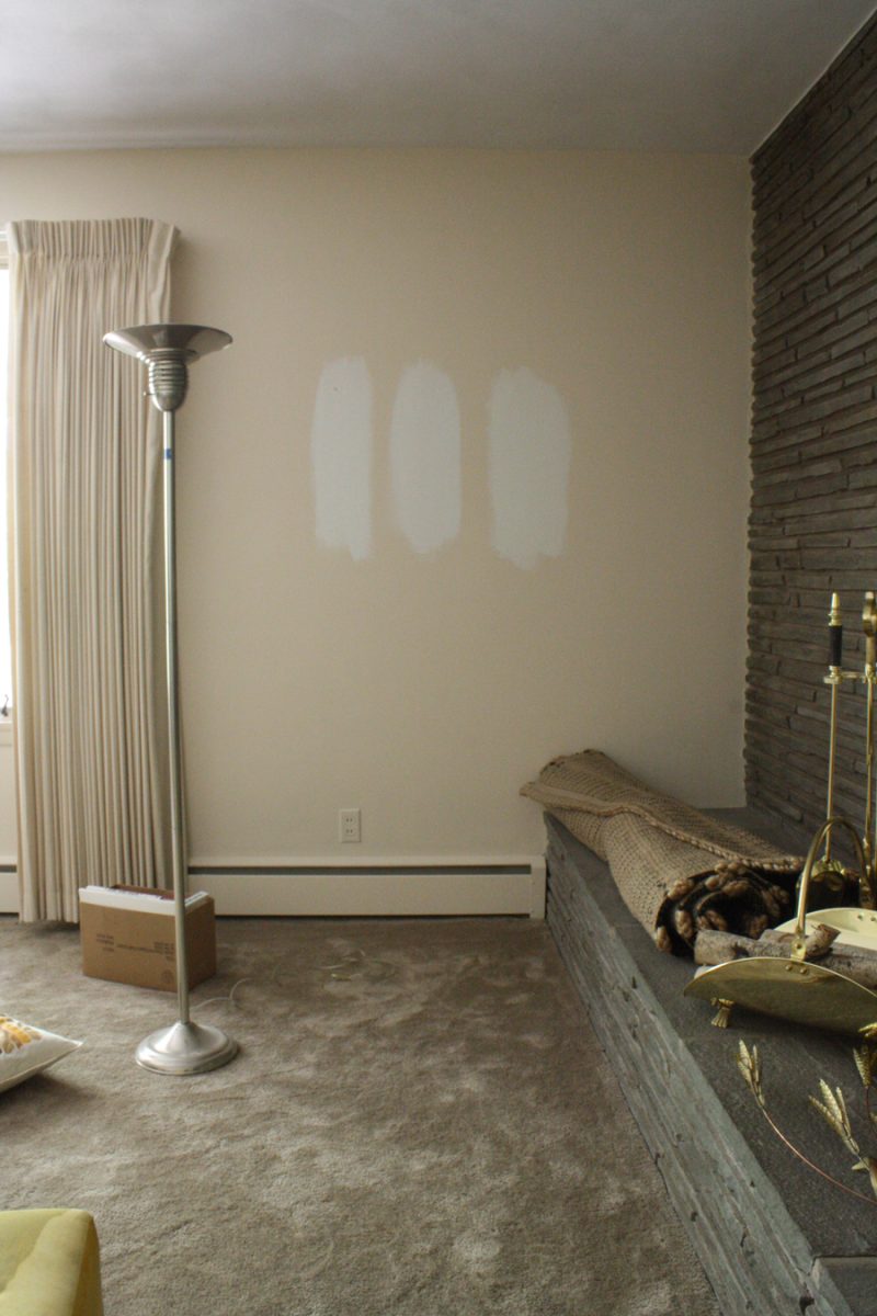
Sherwin William Colors (L to R): Extra White (SW 7006), Snowbound (SW 7004), and Alabaster (SW 7008)
That’s right. As of this week, our house is color-free. Are we wild cats or what?
My last home had a lot of natural light. It was also much more segmented in terms of each room having clear boundaries; it wasn’t as open concept as this ranch house is. In buying my old house, I was escaping apartment life and a world of can’t-touch-those-white-walls. Naturally, in my transitional house, my bachelorette pad, I embraced color. And damn, I adored it, I made that pretty clear. I still do adore it, really, but I’ve gotten my fill.
There are more than a few great things about embracing color on walls, but this house is different. We decided to start neutral, go white, and backfill with colorful accents and lighter floors. Then, if desired, we could always go back and add some color to the walls in the future. It’s our house! Repaint! No laws!
We’ve done a whole lotta “WOW”-ing of this place in the days since we finished priming. That one little flat coat of white that we applied over the course of a weekend did so much to this place, we knew that overlaying a Snowbound eggshell (or eg-shel?) would make it look that much better, what with a little thicker and slightly glossier finish to help the light bounce in the house.
Everything considered, I took Sherwin-Williams up on its offer to sponsor our summertime wall painting and accept 5 gallons of free paint in exchange for us trying it out in our house. Each gallon was valued at about $50 (2013 pricing). They agreed to let me test the Harmony Zero VOC paint product, which is slowly being rolled out through all of their retail stores.
Zero VOC is the perfect fit for me and our growing family, what with the long lingering VOCs that are emitted from other paints long after they have dried. We keep it no secret what brands we’ve used in the past–let’s just say that I’ve taken in enough VOCs for a lifetime, and that’s probably why I can never remember where I left my glasses–but we’re excited to try this product and embrace a practical sponsorship. I hope you appreciate the transparency in this very experiential review.

Harmony Zero VOC paint by Sherwin-Williams, tinted to Snowbound.
How to Choose the Right Shade of White Paint
Snowbound SW 7004, a white that many/all/myself included would describe as almost white out of the can, is actually on the cooler side of the white spectrum. (Super fun fact, according to my local store, White by Sherwin-Williams is white right out of the can.)
I did a little/lot/somewhere in the middle amount of research when it came to warm vs. cool whites, and everyone has their opinions. So many opinions, written in such strongly worded language, that if I showed you snippets you’d probably assume that it was text from a political debate or your local FB parenting group. This isn’t one of those posts.
What did help in researching was that I was able to compare photos of the rooms already painted in these various shades. More so than focusing on the design aesthetic of the rooms that were bright white, I honed in on the size of the room, the number of windows, the ceiling height, and other basic features like fireplaces, trim, and floors. It was from there that I decided to follow my gut and go with a cooler shade of white. Cooler seemed right, I didn’t want to end up with something too yellow-based or tan. And, if something about the cool paint looked horribly wrong, well, it’s just paint.
But I really loved it right from the get-go. (Editor’s update 2020: I did a fresh review expressing just how much we still enjoy Snowbound Sherwin Williams when we painted our new kitchen.)
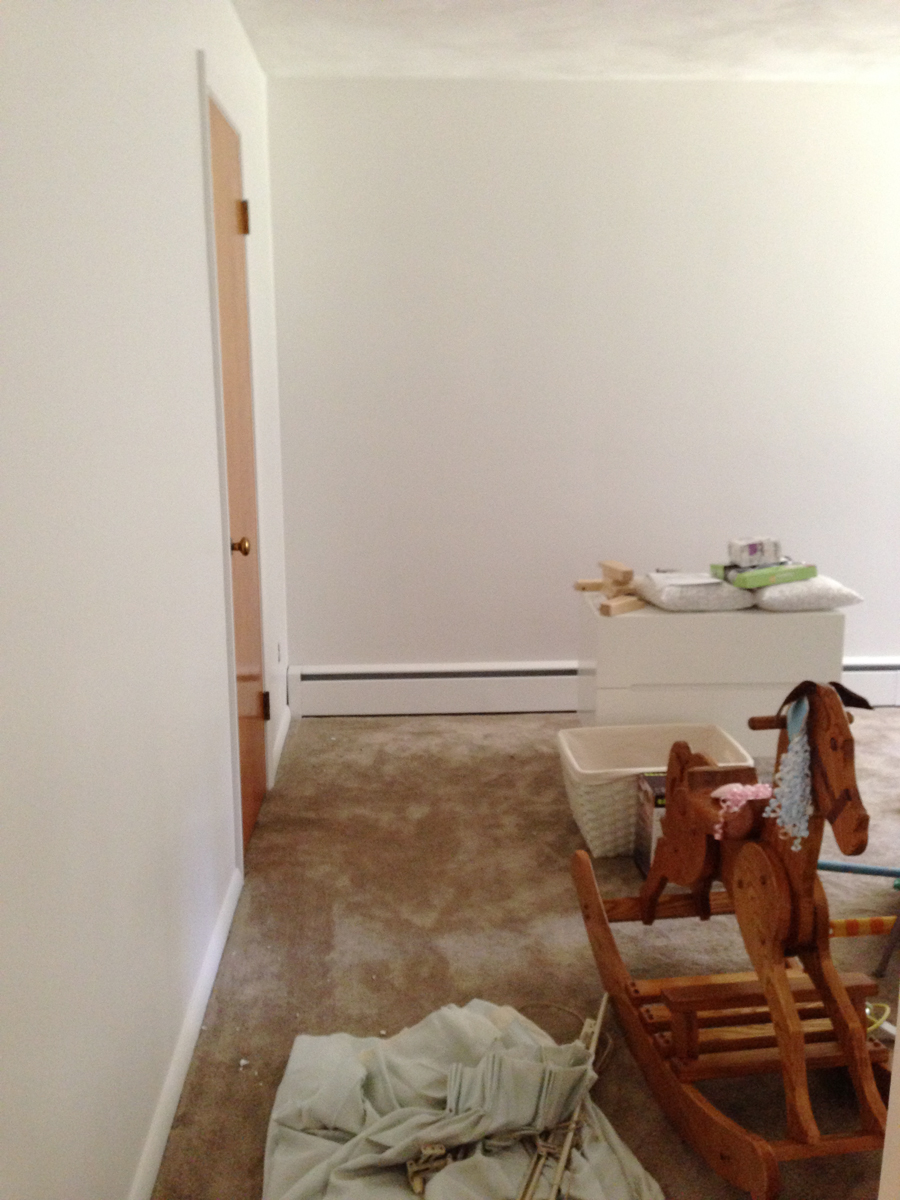
Sherwin Williams Snowbound covers light blue walls in our to-be nursery.
Painting the House White
Like with the priming, Pete and I tag-teamed this project. We didn’t do it over the course of two days this time, but we fit in a room here and there as we were able to make time for it.
I cut in and focused on the trim work. Pete rolled. And often, we worked on opposite schedules just to get progress made where we could. He’d paint while I was on a conference call, I’d paint while he picked up Julia from camp. He’d do the morning coffee run, I’d do the afternoon. Teamwork, yo.

Cutting in around the stonework in our living room. The paint that appears to be on the stone was from the previous owners, who must have had the room sprayed before selling. We’ve scrubbed most of it off!
We purchased our own rollers for the job, a rare splurge for the “best” quality in the store. (Better quality = less shedding, white paint = shows more imperfections).
Timing of the actual labor actually had a lot to do with the available sunlight in the house as well. Rolling white paint over white primer is a lot harder to do on a shady day or at night. There just isn’t as great of a distinction between the two, except for seeing where it was wet and still glossy, and where it was flat and already dry. All painting had to happen on days with excellent sunlight to help illuminate our house.

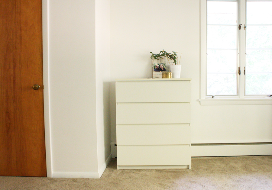
Sherwin Williams Snowbound in the primary bedroom.
Good Coverage From a VOC Paint
I’ve heard a lot about poor coverage with low/Zero VOCs, so I did wonder if it would require multiple coats. In our case, we had no problem. Of course, with the primer, we were going over light base coats, and with the Harmony paint we were going over white primer.
It was hard to capture a clear change between the paint and the primer as we worked. In this next photo, I like to think you can see where the still-wet glossier eggshell paint begins. Yeah? No? Clearly, the camera had no idea where it wanted to focus.

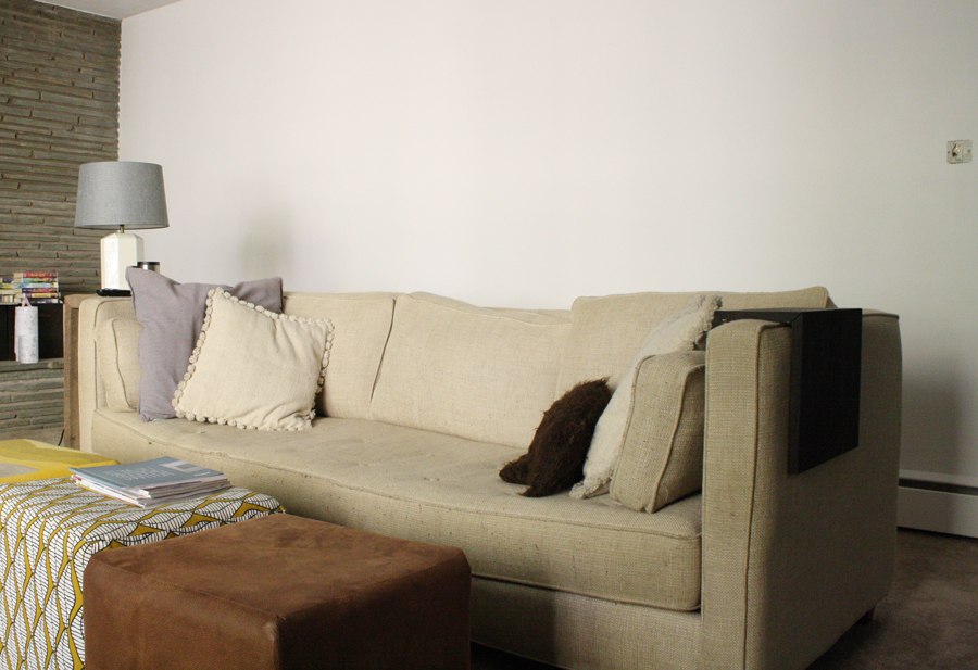
Sherwin Williams Snowbound has lived up to our expectations, brightening our home and allowing us to see it in a new way. This is a good example of white paint that doesn’t look too “cool.” In the living room, the new couch is still set to arrive in the coming weeks, and after that, new floors.
The wavy glass wall between the living room and the dining room was removed too. You’d never know it was there, but the line of sight between rooms is much improved. In other news, we bought Julia a mini-POÄNG last time we were at IKEA, among other new things.

Finishing the walls means we can start on the flooring, on the decor, on the other details that will eventually need our attention. Yes, the Jade is on the verge of collapse.
What do you think?


10 Comments
great partnership. love SW. and the white (my guess with a subtle blue tone) gives you a nice clean canvas to build out around… but I’m sure you already know that. ha! good progress good post. cheers. ~jb
Thanks jb, I expected to see more of a subtle blue in it, but I still don’t really notice it. Maybe the beige of the carpet is still keeping things on the warmer side. Also, Snowbound is literally one step in the cooler direction on the SW spectrum, there were a few more “cool white” options that were more noticeably blue-ish.
That’s a really pretty white. I’m a sucker for pretty white walls. And I never thought I’d be that person, but there it is. It so exciting to see your house transform!
Thanks Kimberley! I never knew I’d be a sucker for it after living in so many white apartments…
I think white is a great choice! I painted my bedroom white not too long ago, and am mustering up the courage to do my living room and vaulted ceiling. The entire dang this is purple and I’m only one person. This paint could be a good option for me though as I’ve got a little living in the house with me and you know, I care about thing like keeping him healthy. Thanks for sharing!
Thanks Gloria! The Zero VOC opportunity was one I just couldn’t pass up… normally I’m quick to shop the best price, and I’ve even thought that another brand of Zero VOCs had a distinct smell to it, but I didn’t notice anything off-putting from the primer OR the paint that we used this time around. In fact, we would have people to the house the day after we painted a whole room, and they couldn’t tell that it was “fresh paint” by the smell. Worth it in my opinion, and especially if it’s too cool to ventilate your house for days and weeks at a time..
Did you paint your trim the same color? Looks great!
Yes, we did.
I love white colors. White makes the house looks clean and calm. Amazing paint recommendation. Well done!
Amazing tips , Thanks for sharing this blog post . I love white colour also