This post was originally published on DIY Network’s blog Made + Remade in July 2014.

Hey there, you’re probably a lot like me when it comes to the DIY makeover thing. Wanting instant gratification with the snap of your fingers, over the course of a single weekend, with one quick and easy update that will make your home look so pretty like a photo out of a design magazine. In reality, sometimes things take longer, and I’m living proof of that with the kitchen updates that I scoped out as my big New Years Resolution. No one is still talking about New Years Resolutions, right? Right. Just me. In July.
Painting the cabinets in my 1950s kitchen has been high on the top of the list, but for obvious reasons (snow! ice! extreme cold!), I couldn’t easily refinish them in middle of winter in New York State. Summer and Fall are much more appropriate seasons for a project like this, at a time when the temps are friendlier for ventilation and for paint curing.
I like to do a lot of researching too before I start big projects – this usually involves researching period-appropriate mid-century paint colors, paint brands, finishes, techniques, etc. Honestly, we do love the natural wood of the cabinetry (see some of the original kitchen photos here), it’s the fact that the base cabinets have already been painted that make us feel that giving them an entirely new look will help to unify the kitchen, and give it a nice refresh.
Trying on Cabinet Colors
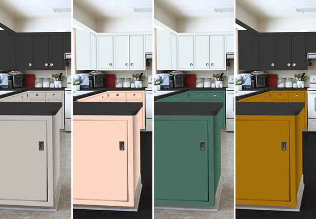
Being married to an artist is a luxury in the sense that you can use Photoshop to manipulate colors before committing, but I’ve also been known to take a paint brush to paper to get a better sense of how a color will look in the home (just check out my technique for picking staircase paint colors).
Seeing the kitchen through the eyes of a Photoshop filter really helps to visualize how the space would look if the top and bottom cabinets were very dark. The rest of our home is maple and white, so this would be a big contrast. In this scenario, I could even see leaving the floors as-is with the lighter color to keep the space from looking too dark.

Photoshop also lets me experiment with fun colors. In our initial discussions, neither of us were so open to being daring with color in this space, and were quick to dismiss a sunny yellow. But here? I actually can visualize it in the space, and I think I might like it. I also like to see how it might look if the top cabinets were a different color.

While countertops and floors were not part of our original scope, I have been pricing out options, you know, just in case. Dark countertops would be great, but whether or not floors are necessary seems to depend more on the base cabinet color.

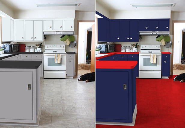
There are a lot of great color options on our short list right now, so it’s going to be tough to make a final decision. And of course, he threw in a Buffalo Bills-themed kitchen just for kicks. Cute, but no thank you, honey.


Leave A Reply