Not terribly long after I launched Merrypad, I posted about my then-current paint palette.
That graphic looked something like this:
But in the last year, likely because I was challenging myself with blog-related projects and daring myself to try new products and colors, that palette has evolved. Not overnight or anything, just really slowly, really gradually over the course of time. Last week when I organized the pegboard and sorted all of my color chips into one centralized basket, I noticed something:
The palette had evolved into a full rainbow.
I’m not surprised. I’m always drawn to golds, oranges, and greens in this house. I’ve always loved all grays too. And the light blues and pinks made me happy when I browsed stores and picked through paint samples. There you have it. I’m indecisive.
And because I firmly believe that any color could work anywhere, I’m really not the right person to ask what color you should paint a room in your home.
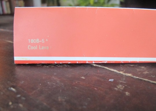
Side note: I’ve mentioned it before and I’ll mention it again… I originally painted the dining room a cool lava coral pink. And it was fabulous. It didn’t work out in this space, but I will find a better use for it someday. I am holding onto the paint chip, after all.
This whole rainbow palette might a little out there. Maybe you’re imagining that my house looks straight out of Rainbow Brite, but I like to integrate all colors throughout all rooms to make the transition from room-to-room feel more cohesive, even when the walls are different colors.
I thought it might be helpful to show you how the colors balance out, and are working out. And I’m officially looking for a color-analyst to help me figure out what this specific combination says about my personality.
On the main floor, golds and greens rule the roost. White has been inserted as the more-neutral backdrop, covering the walls of the kitchen and unifying all of the trim. The four colors to the right side serve less-impacting roles, acting as decor accents and friendly pops of color. These are the four colors I tend to lean towards when I’m in home shopping mode or looking to refinish something with paint.
 On the second floor, grayscale has been consistently ruling. More blues and whites appear between the guest room and office, but the decor throughout all rooms helps to tie the space together. The stairwell brings in heavy gold from the first floor; I love how the gray and that gold vibe together. And the hardwoods are consistent throughout (except with the need-to-be-replaced gray vinyl tiles in the bathroom).


9 Comments
Our color choices have definitely changed over the two years we’ve owned our house. We went bolder in some places, and more toned down in others. I think it stayed pretty cohesive, but at times I’m tempted to repaint the entire house a bit more like our exterior palette.
It’s fun to think about mixing things up! Your exterior palette is great too. Sometimes I think about just going all white and letting the rainbow appear only in accessories, furniture, and decor. Maybe someday.
Your colors go together nicely! When we first moved into our house, each room had its very own dizzying wallpaper and I didn’t like how disjointed the house felt. Unintentionally, I did start using the same colors in different rooms – at first because I was stretching furniture from a 1 bedroom apartment into a regular house and later because I realized that there are just certain colors I prefer to look at all day. There are shades of warm brown, with robin’s egg blue, leafy green, and even a darker version of cool lava on the ground floor and little pops of red in most of the rooms upstairs to offset the mostly blue/gray palette. Always a work in progress :)
I have lava-esque envy! And boy, I’m glad I didn’t have too much crazy wallpaper to deal with…
Our current home has a lot of aqua, white, gray and pops of pink. But now that we’re moving I’m thinking we’ll change things up in the next place. My husband and I were discussing a more masculine palette of white, gray, black and deep turquoisey blue with shots of vibrant colors for our new place, but nothing is set in stone yet. We’ll see what happens I guess!
I’ll get on board with that more masculine palette – I’m always drawn to the cleanliness of white and gray with fresh colors when I see it shown in mags. When do you move?
love the color palette and how it’s changed over time. We’re coming up on our 2 year home anniversary and while I LOVE all of our decor choices, there are some things that I wouldn’t mind changing here and there… LOL… it’s amazing how much you grow as a homeowner in just a little bit of time. ;)
Thanks Ashley! Agreed that there are always things changing and evolving. I think part of it is that you acquire more and more, so it becomes like more layers in the same space. Very onion-y an analogy.
so true! Layers = warmth and love… and onion layers!