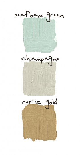
It’s not often that I feel compelled to change wall colors. When it comes right down to it, painting over and over again is a total bother, and I don’t like painting enough to make it a reoccurring project. Nonetheless, this little bugger really got to me:
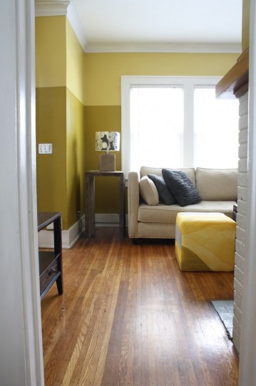
That nugget of Rustic Gold caught my eye because it’s very much like the Burnished Bronze and Venetian Gold colors that occupy my own living space. Three years in and I still adore its depth and warmth. In real life, it’s a surprisingly neutral hue and accepts most every shade as a viable counterpart; I have it color blocked with Behr’s Summer Field in the living room and on the north wall of the dining room. Works with every mood. Vibes with every season.
It wasn’t until I saw that friendly little paint swatch pinned on Pinterest that I began considering alternate color pairings for my own Rustic Gold, a complementary color that was a little bit lighter, a little bit less yellow, like the Champagne that it was featured with. All I know is that something more champagne and less summer field would let me also embrace the fun seafoam green on the pinned paint palette too (but let’s not even get into that yet).
So, I did what any normal person would do: I brought home 52 paint chips.
A lot of options, yes, but each of the 52 shades need not apply for the position; shades similar to my current dark gold, for instance, were just on the same palettes as other light and champagne-y favorable shades. And there seemed to be a lot of green on the table when I got home. And that was disappointing. Those florescent store lights really trick a girl’s eye.
I narrowed down quickly to 10 options (no over thinking), and then chiseled the selection to three clean choices, each of which I then had morphed into sample pot form at Home Depot. As I found with Julia’s bedroom paint options, the samples are a good way to go, and the three that I brought home were:
- Behr Sliced Cucumber
- Behr Desert Springs
- Valspar Fennel Splash (as a custom color match)
In various placements throughout the living room and dining room, I’m having a hard time making a decision on what I like more, or if I still like the original summer field yellow and should ditch the idea of mixing it up. Help me out.
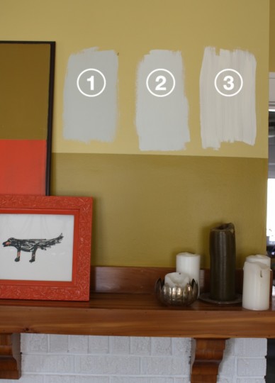
Coordinating with the above numerical order, here’s how it looks above the mantle (beside a shade of orange that is currently an accent color throughout the house):
And on a wall beside the sunroom door above our repaired Sauder shelving unit:
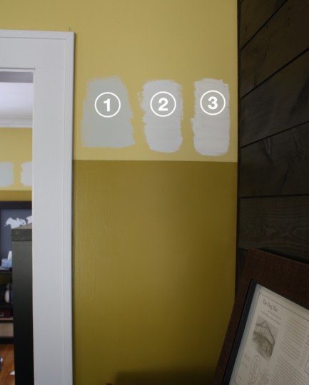
And also in a wall that faces the dining room, adjacent to the shiplap paneled wall. In this picture, you can catch a glimpse of the above swatches in the background:
I’m liking #3 and I think it’s the most like the sample Champagne. But that’s not for certain, because #2 looks pretty in the shade and in the incandescent light, although it’s definitely more gray than champagne. And I also still like the summer field color that was there originally, but I am starting to think it’s too cheery-yellow in comparison to these other more neutral options. #1 is out for the count because it’s blue-green in person, not champagne, and looks wrong in every light. What do you think?
P.S. The paint swatch pin at the beginning of this post had been uploaded to Pinterest by someone else and lacks its source URL (gasp). If you know where it originated, let me know. If you made it, you’re a genius.
P.P.S. Lots of paint palette talk in this post. Interested in seeing all of the colors? Check out this post.


21 Comments
I think #3 is best. I am working on picking paint for my bedroom and its so hard! I came home with a bunch of samples yesterday and taped the final 5 on my wall yesterday. I still can’t decide! They all look so different in different lights.
It is hard! What shade are you looking into for your own room, or is it a whole assortment of colors?
Well, I picked out Glistening Moonlight and Swiss Coffee both by Behr. But I also picked out Soft Candlelight and Vanilla Custard. My problem is my bedroom is small and I have big dark wood furniture and the trim around the room is a medium brown wood. I really need to brighten the room and I can’t seem to find any inspiration online for small bedrooms with brown wood trim, all the pics I find have white trim which doesn’t help my imagination!
I love nice brown trim, but I love me some jewel tones with it. For something lighter, I’d definitely imagine that a “white” with brown undertones would be nice. Was Swiss Coffee too dark?
Just to add, I bought my dark wood furniture when I lived on my own and I love it. Then I moved back in with my parents (rent free, so thankful) while going to grad school. So all my big adult furniture went into my small childhood bedroom with all the medium brown trim. I love wood but its just too much!
Actually the swiss coffee is what I am loving right now. Its light enough to look white but a light tan/beige in some lights. Thanks for your input :)
Personally, I still love the Summer Field color on top of the gold, but if I had to choose one of the new shades, I definitely think #2 pairs the best with the Venetian Gold. #1 is definitely wrong, like you said, and #3 just has an uncomfortable pastiness to it that looks too cold against such a warm gold. The second sample has the best contrast!
Thanks for that wonderful and honest insight, Amy!! When you look at the sample palette at the top of this post, does the Champagne color come across as cold too, or do you think it’s just because my gold is a little different (less brown, more green I think)…
I think the colder champagne in the sample palette works simply because the gold is more brown. I agree that your gold is more green than brown, but I think the warmness of it is what makes it work so beautifully with the dark wood tones and vibrant orange accents you have scattered about. I’d also like to add that I absolutely adore every inch of your home, you’ve styled it so brilliantly!
Argh. This is both puzzling and troubling. (Thanks for stopping by, so glad to hear you like my home! :) )
I liked #3 before I saw that it was what you were thinking. The undertones are similar to the gold—it’s a warm color, and #1 and #2 are cool and have too much grey in them. My two cents!
Thanks Kate!!
Number 3 is the winner for me!
I’ve just done the same and brought home a small pile of paint charts for the exterior of the house.
I like the summer field and gold just the way it is!…Adding the other, more gray, color will make it colder overall (I think you’d really notice this in the winter)…..I also feel that the grays do not settle well with the gold and you would end up needing a dark border between the two for a transition (yet another color to pick)….”Works with every mood. Vibes with every season.”, is not an easy thing to come by and if it’s not saying, “Paint me now!” then wait until it does. For the time being, paint a BIG test piece of foam core, canvas or something like that with your favorite new color and hang it over the existing wall colors, overlap them etc. Leave it for a few days over each color. This should give you a better idea of how much you like the interaction before you paint the room and then can’t stand it. If you love the test piece enough, the room will say “Paint me now!”….maybe it already does. Good luck!
Agreed with the grays! It’s always a bummer when the paint chip ends up looking dramatically different than what you expected. And for the record, the colors on the wall do match the paper swatches, so maybe it’s the underlaying yellow or reflection of other colors in the room that change its tone in real life.
Good idea about painting some bigger temporary swatches. Thanks!
If you absolutely feel you must, #3 looks the nicest, for the same reasons Kate said above. But I like the yellow a lot and would say don’t change!
The yellow looks really nice at nighttime, as I sit here admiring it. It actually looks completely different than the sunny yellow in all of my daytime photos, more like a mustard golden. HARD CHOICES.
I love the #3 color and might have to test that one for myself! However, I think #2 plays better with the gold, at least on my screen. What color is the brick painted on the first test swatch picture? Would the champagne compliment or compete with it? I definitely agree with Kirk to do the much larger and easily removable test swatch!
The bricks (and all of the trim and crown moulding in the room) are white, so a little contrast would look nice. I have to try that big swatch idea, pronto.
I was thinking I lied number 1 best, but the more that I imagine the colors contrasting each other, I agree with the others and cast my vote for number 3!
I was wondering who makes the Rustic Gold color showed in the picture?