It worked!
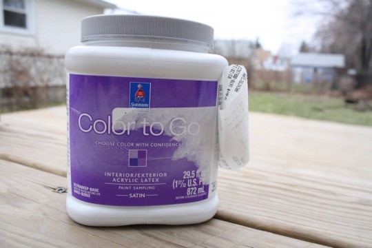
The paint I bought from Sherwin-Williams ended up getting an A+ in my book (slash blog review). Here’s the brief recap of how Energetic and Laughing Orange came to be (read the whole thing here if you want): Buy-one-get-one coupon yields me testing two colors of satin Color-To-Go paint samples from Sherwin-Williams for $5.34 including tax. Hurrah. Problem? This sample formula of paint [allegedly] lacks the bonding and wearability that the premium paint brand prides itself on offering.
I’m up for a good challenge, and love a good sale, so I couldn’t say no. In this case, I decided to start my testing by modifying several all-black picture frames which were just never taken seriously in my house (I’m a lover of the grays and browns, but black is usually just too harsh with my pale skin tone and my palette). One of the frames was square with a white mat from Pottery Barn. I also had a few similar square knockoffs from the IKEA RIBBA collection. I also tapped into some of my 5×7 black frames (mostly garage sale finds) that I was content to sacrifice for creative testing.
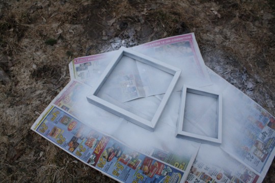
To increase the possibility of obtaining awesome results, I tapped into a few products I already had on hand – a handy spray primer and glossy clear topcoat. The Rust-Oleum brand is a little more expensive than some of the other products I’ve tried, but it goes on nice and smooth, and as you can see in this variety, claims to be doubly good at coverage. I can’t disagree with that one.
 The spray primer was essential to prepare the surface of the frame, which was finished and semi-glossy smooth on all of my test subjects. A light sanding prior to spraying ensured any irregularities were leveled out, and made a nice surface for the primer to adhere to. While I’m pretty sure most DIY’ers would encourage you to do this, I admit that I forgot to do it on one of the frames and I can’t tell the difference. What is good is to give the frame a light sanding between coats of paint (which I did 2-3 coats of), but I’m getting ahead of myself.
I chose a nice snow-free section of the backyard and laid down a few layers of newspaper to make a spray priming surface. And then I sprayed, let it dry outside for about an hour and inside overnight (when it’s cooler or in the shade, allow generous dry-time).
I test painted one frame with the yellow-orange, and the other with the tomato-soup orange. The lighter of the colors required three coats, and the darker needed only two for adequate coverage, despite starting the project with a level playing field. I didn’t even take any photos of the project in progress, which is unlike me, but believe me when I say you’re not really missing anything here.
FYI – I also applied all paint with a foam brush because 1) they allow a nice smooth finish; 2) I love home improvement but dislike cleaning paintbrushes; 3) I had a LOT of foam brushes after finding them on sale 15 for $1 at the craft store:
But I’m really excited to share how wonderfully these frames turned out after the respective 2-3 coats of paint! The yellow frame in this shot had been sprayed with the clear gloss, and the darker orange-red had not been (so you can see the difference between having that top coat and not). I notice that a lot of the fine brush strokes disappear once the topcoat is applied and dried:
 And so, when I got going, the frames really started to look great. Between giving time between coats of paint and time to really let that top coat of spray gloss cure, it took me about 5 days to get as far as I have today. The art I selected for these frames is a mix of hand-drawn (by 4-year-old handy-girl) and hand-selected tear sheets that I’ve collected from the frequently distributed Anthropologie catalogues. (I’ve got a good habit of saving the images I adore, and it’s a nice stash to tap into when I need a colorful print. Remind me that I need to show you what I’ve done in my kitchen with these tear sheets.)
Just a little bit closer on the amazing glossiness that each of the frames left me with:
A favorite tear sheet featured a beautifully photographed book (The Secret Garden) with a meticulously designed cover. The palette of this book cover ironically matches both the energetic orange and laughing orange frames; can you tell how giddy I was to realize I had this in my tear sheet stash?
And sometimes all you need is a perfectly hand-drawn rainbow on crisp white paper.
 So, I gave this project an A+. Why? I’m totally, 100% convinced that for a project like this (one which isn’t going to have to endure lots of wear and tear) the Sherwin-Williams Color-To-Go color samples are worthy of your time if you’re going to make the effort to properly prepare the base of the project and add a decent top-coat. Without the top coat, the “satin” finish would have been a little too matte for my liking and possibly more brittle a surface.
And, I’ve barely dipped into each color sample. I see lots of “energetic” and “laughing” inspired projects in my near future.


6 Comments
amen sister. we use this stuff all the time!
The salesman in the store was really trying to put it down. I’m happy it worked well for you too!
So cute! We use the Valspar samples a lot, but they’re not nearly as big.
I know! I was stunned by the volume of these containers. I’ve done a LOT of frames now and they barely look touched.
What is the drying time between coats of the sample paint?
Same as normal paint! A few hours to be safe, more depending on thickness.