… And now I’m doing a happy stair-planning dance. The project I finally decided to be brave enough to do? Painting those stairs. Here’s to hoping I don’t revert into the most indecisive person on earth (you know how much I love color).
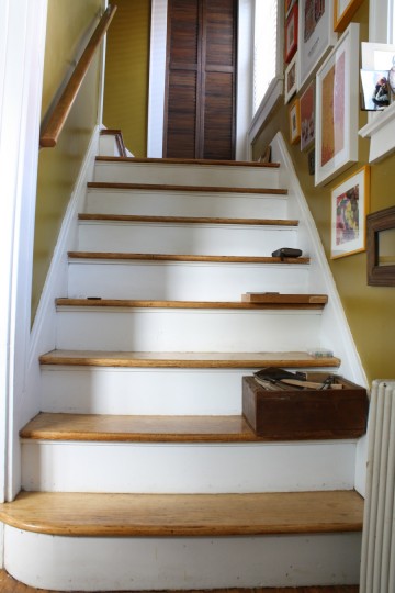
The stairwell leading to the second story (the bedrooms and bathroom are up yonder) was once carpeted, but has since been unveiled, refinished, and poly’ed to a glossy, glossy state of glossiness. You can see that transformation over in the before + after section. And I love them – I’m not actually painting over any of the natural hardwoods here, but I’m ready for a little something different. Where once was white will be no more.

If you follow me on pinterest or have ever spoken to me about stair porn (yes, it’s a real site), you probably know I have major staircase envy. And I’ve said it before and I’ll say it again, I love me some color.
The homeowners who dare to revamp their otherwise-ordinary staircases with bright colors, stencils, or Orla Kiely wallpaper (drool.)? I want to be them. Yes, for real, I’m going to paint my stairs, and hopefully make an appealing update (if it ends up being vomit-inducing, that’ll be a problem, since it’s the first thing you see when you walk in the front door).
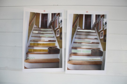
I started the whole planning process this go-around with the simple photo of the staircase (just that quickie shot shown at the beginning of the post); I printed out a few copies of the photo so that I could use the real images as a sketch pad (or activity book, or coloring book), and then spent some time sitting in the entryway giving owed consideration to the colors of the frames in the wall photo gallery, the glow of the hardwood floors, and the color of the walls. I brought up the house paints from the basement, spread them out on the ground, and started playing with a dozen paint brushes mixing colors to see what hues might work best with the other colors in the space. You more artistically adept folks might just want to use photoshop to drop in colors, but I didn’t because I wanted to work with the real paint colors from the palette… and because I don’t have it on my machine.
Once I finished my little art project, I pinned my modified printouts up on the sunroom wall. The one in the center is higher because I’m (waveringly) voting it the leader. Read on.
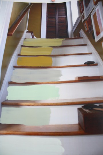
On each sheet, I tried to incorporate many hues and a few different plans to see if I should use more than one color on each step, and if so, tried to gauge which colors worked together best with the wall color and bright picture frames. Orange was a thumbs down, as much as I like it as an accent color. Horizontal stripes of multiple colors are looking like a promising idea. And I’m digging the light blues, but maybe that’s because I just finished using it to paint the entryway wall.
 The light green/gray color you’re seeing is actually very similar to the handmade shade that I used when I painted the sunroom floor (a sly concoction of Behr 2-in-1 Tiffany Box Blue from a $1 Oops Bin at Home Depot and a splash of floor paint gray). I was thinking it might be nice to try and pull that muted but bright color into the rest of the house subtly, so this was an attempt to see how it might fly. Also tested: polka dots and chevron. Without the use of a real stencil it would be harder to hand-detail a design (and I’m not totally sure I want to make another one like this but it’s not out of the question yet, just awaiting the right inspiration).
As I said, the photo that was raised in the center is showing the most promise to me right now (that’s not to say it won’t change tomorrow when I realize I have more blue painter’s tape than I expected). The top three stairs pull the original gold wall color and lighten it gradually with gray, going upward; it’s the kind of color combo that I wasn’t sure would work well, but it seemed to in this test. The bottom four stairs do something similar with the Tiffany’s blue and gray paint (like the sunroom floor dots).

It’s going to be an indecisive few days. The biggest part is doing it in a way that it’s something that I can live with, without overpowering the other colors and elements in the small space. Await and see more; I’m hoping to make my pick and start the ball rolling (or… paint stirrin’) by the weekend.
(And, as always, votes and suggestions are appreciated, my fine and tasteful readers!)


7 Comments
You know I love all things blue, blue-green-gray-y (that’s a technical term) and bright yellow. I like the idea you’re leaning towards. :)
I think if I had stairs I would try something like blue and yellow chevron (or some pattern). Though it would be, super hard to make look right. So maybe I’d end up using wallpaper (or, on the cheap, scrapbook paper) to add interest.
Can’t wait to see what you do!
I’m so anxious to start. (Wish I had more time today.)
I’m LOVING the grey (highest up in the last pic) or the yellow, any of the three in the last picture! Can’t wait to see how it looks! I would be totally indecisive too! That is just a TON of options! Not to mention if you get into patterns!!!
woah. Awesome stairs. I’m dying for my own staircase so I can mirror tile it. Love the colors you are thinking of, and all your stairs on pinterest. Going. To. Be. So. Much. Fun.
Thanks for the nice comment, Zanne! Mirrored stairs would be very cool.
I thought of you the other day and this post on your stairs…I was reading June’s Country Living and on page 92 they have painted their stairs as well you should check it out!!! Good luck on yours!! xoxo
I will look for it!! Thank you for letting me know!