Every once in awhile I get up the courage to invite myself into someone else’s really cool home to do a little feature on their design aesthetics, and luckily for me, Pete and Donna were eager and inviting (yay, and thank you guys!). You see, their masterpiece is one that’s a dream of my own: they gutted, renovated, and customized a home into what I can only describe as a mid-century styled open concept dream pad. With a cherry on top. If you liked last summer’s beach house tour, I think you’re going to really like this one too.
A lot of people cite not being able to see the diamond in the rough when they’re in the house shopping frame of mind (or maybe I’ve just watched too many episodes of House Hunters and Property Brothers), but this husband/wife team spends their days creative directing and making beautiful things happen in the world of advertising; the fact that their home follows suit really comes as no big surprise.
The 1963 single family home is in a beautiful and well-maintained neighborhood in Rochester, NY, but like any neighborhood, updates are imminent, and finding the right house, with the right bones capable of withstanding your dream vision is just part of the battle.
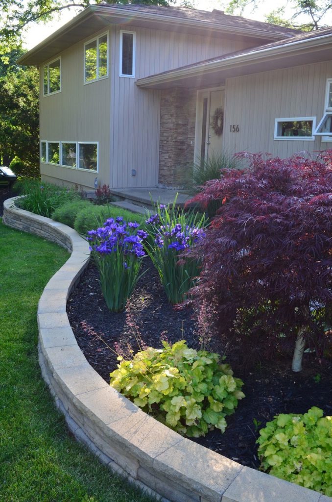
The after – a thorough interior and exterior renovation that took place over 8 months in 2008 – proves that dramatic things happen when you set your mind to it. With the help of their friend and contractor Mark Laese of ArchWood Inc., their house has been transformed into an incredible new space:
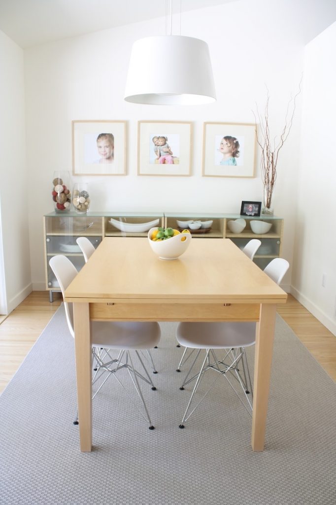
I’ve been inside their home once or twice in the past (we’re real-life friends, lucky us) but the beauty of their vision impresses me every time. It’s nothing but bright, expansive, and airy, highlighted with large windows, a thoughtfully-planned layout, and contemporary furniture. Striking details upon entry? The front door, the transition from natural hardwoods to 12″x24″ tiles, and clean-lined light fixtures throughout. And there’s a plentiful balance of Eames and IKEA for flavor.
I love a home flooded with varied artwork, and Pete and Donna have successfully blended commissioned art, oversized prints, professional family photographs, and the artwork that their two daughters have created to form their own gallery.
A feature piece in their living room really sets the tone for their overall aestetic; this custom mixed-media commission by local artist Kurt Ketchum, was designed thoughtfully to commemorate their family (four quadrants for four people). What you can’t tell until you’re standing at it up close it is that it’s even more meaningful than that–captured within the design are many personal details including the years of their birth, floor plans from this very home renovation, and clippings of vintage newspapers that they found in the walls (those letters were organized to spell out “love”). Additionally, the artist was able to incorporate lyrics reminiscent to their wedding, and include a song that their older daughter wrote to the younger. The bench in the picture is a great vintage and second-hand shop in Rochester, Metro Retro, and I’m very envious of it.
It’s a little hard to tell in that above photo, but the behind that wall is their mudroom off the garage; without having pictures to explain it, imagine this: the ceiling of their large mud room was left open when they vaulted the living room ceiling during renovation, allowing natural light from the rest of the house to flood in and subtle ventilation for rain jackets and winter boots.
If you never wanted an open concept home before, you’d want one after seeing how Pete and Donna took advantage of their home’s space. Originally not an open concept floor plan, one goal of the renovation was to create long lines of sight throughout the house. From a single vantage point, you can pivot to see their dining table, into the kitchen, and across the living room into the backyard. I ended up with a lot of great pictures from inside their home, so I’m stacking many of them up.
Pete and Donna were also intent on incorporating clean, modern lines in all aspects of their home’s architecture and design. Here’s a subtle reminder that you too can reface your uggo brick fireplace and wind up with something amazing:
And it can’t go unsaid – they have great taste in furniture, fixtures, and decor. I’m taking notes on their mad minimization skills, especially the simplicity of the accents on their mantle. Most days, our mantle looks like a junk drawer in comparison.
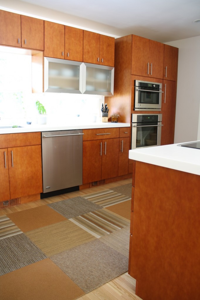
Let’s talk about how nice this kitchen is.
But what did it look like before? Like most other mid-century kitchens:
The brand new modern cabinets are the object of our heart’s desire. Self-closing drawers are a dream feature, and something that both my Pete and I are set on investing in someday (these cabinets are by Ward’s Cabinetry). And dudes, in the third photo of the next set, note how their frosted glass door opens vertically, saving space and moreover making me feel like I’m hanging with the Jetsons. Almost all appliances in the kitchen are GE Monogram, and the countertop is LG. When planning their countertop, they went an extra step to make them look thicker than the standard product. Instead of actually being thicker, the counters are designed to overhang the front of the cabinets just enough to provide a chunkier than standard look. And they don’t have any of those clever bevels that somehow end up costing you an extra $18/linear foot–they’re sharp, crisp, oh-so-clean. The drawer pulls that were sourced from Home Depot complete the contemporary look. Donna and Pete have had their FLOR carpet tiles for 3 years, and I can report accurately because I stood on it, it has remained in really great condition, even considering the high-traffic placement.
One more thing to impress? Instead of living with the faux door front blocking wires to their stovetop, they had their contractor incorporate an extra shelf for spices. The space on the back right of the drawer accommodates hanging wires, but there’s still enough space between the base of the shelf and the wires to store a few of their silicone pot holders, and I officially wave the flag, nothing could be more convenient in the kitchen.
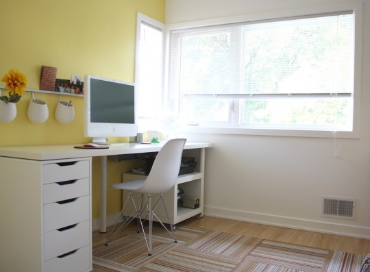
Heading out of the main living space, Pete and Donna have have a pretty fourth bedroom-turned-office too, featuring another piece of art by Kurt Ketchum, another configuration of FLOR tiles, and IKEA storage and decor accents. That chair, get it in my house now.
Only just starting to experiment with adding color accents, the yellow paint behind their IKEA desk is reasonably new and livens the room up nicely. Love that corner window. I’m channeling their ability to maintain a clean, minimalistic home, because for comparison’s sake, my desk has 8,000 additional papers and 40 loose picture frames stacked on it.
I had forgotten until I came back to their fantastic home that their bathrooms were standalone all-stars in the realm of design and functionality. I’d spend all day in there, probably soaking in that deep freestanding tub.
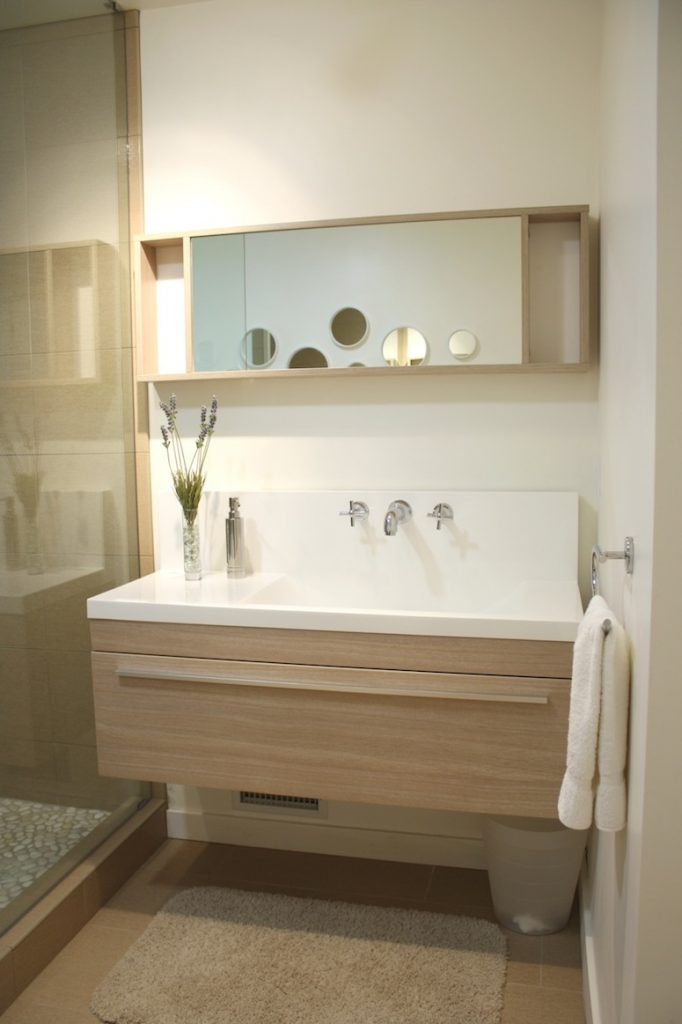
All of their bathroom vanities were sourced online and perfect for their respective space; most (if not all) are floating in design, and accented with beautiful woods and veneers. Bold framed prints contrast the au-natural stone, tile, and clean ceramic accents, adding fun pops of color and eluding to their tastes and character.
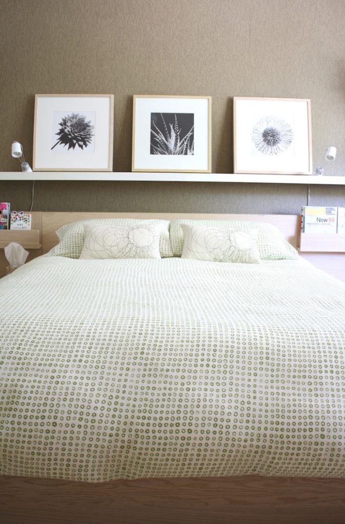
The master bedroom evolved in recent months with the addition of the grasscloth wall paper. In addition to a wall-length closet, the couple vaulted the ceiling during the renovation to make the room feel expansive, and the impact of that change alone is really dramatic. There’s something to be said about being able to put on a shirt without thwacking your wrists on the moving fan blades, and this gets it far out of everyday reach.
Donna and Pete have chosen to use the same 3-drawer MALM IKEA dressers throughout all bedrooms; theirs has 5, for instance, and without obtrusively taking up a lot of space or being the center of focus, they serve as practical storage for not a lot of money. Oh what I could do with a large closet and 4 more chests of drawers.
Again with the minimalism, the decor in the room is really pretty. I especially love the chair in the second picture.
A few other accents in the house really stood out to me: 1. A Scale and corks in the kitchen, 2. lemons and apples on the dining room table, and 3. sleek wooden handrails (I have staircase envy too):
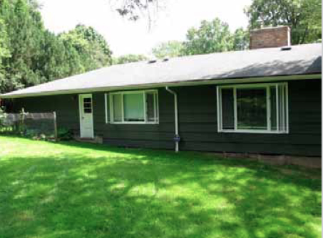
Saving one of the bests for last, we toured the backyard before leaving their home. A full transformation in and of itself, Pete and Donna have renovated every last inch of the backyard, making it a perfect place for family time and large gatherings. First, take a look at the “before”. Hint: It’s virtually unrecognizable:
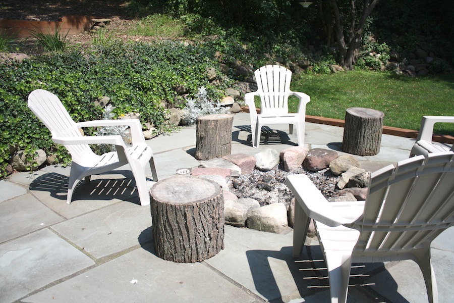
With a new 300-sq. ft. Azek deck, outdoor kitchen, pergola, fire pit with flagstone patio, landscaping and pathways (both of which they did themselves), they admit to having made some splurges along the way, but they’ve completely changed how the space is used. It’s magnificent.
In a midst of a fit of landscaping trials ourselves, seeing their selection of plants was really inspring. The flagstone patio is beautiful (unlike ours, their stones were cut to angle and fit together really snug), and we liked how Pete had stacked logs between neighboring trees, because no one ever said “let me continue to stare at that beautiful refrigerator being stored on your porch, neighbor friend”.
I hoped you liked peeking around. There’s some fun stuff in there, and so many architectural and design details that I didn’t even point out, so I hope you look again closely. If you have any questions on sources, please let me know in the comments and I’ll do my best to get answers!


















Comment
May I ask where you got the bedspread in the master? Thanks!